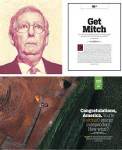
I choose these layouts because, I thought I did well on these pieces for this draft layout portion. I also chose them because, they look like they would be an interesting edgy News lay out for a magazine. It also makes certain things that are about or the topic pop out more; for example, the first one makes a reference of the topic on both pages of the layout which then continues and makes your eyes easily move from one to another and the colors are not too harsh, but show the importance i.e. the red sign and white sign.
-
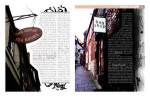
- Magazine Layout example
-
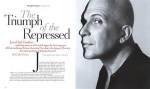
- Magazine Layout example
-
- Magazine Layout example